When I think back to the days before college, I didn’t even know what graphic design was, much less that you could build a career around it. I was a creative kid from a blue-collar town, unsure of what lay beyond high school until a football scholarship landed me at Susquehanna University. Little did I know, this twist of fate would steer me towards my passion and future profession in graphic design.
Susquehanna University, nestled in Selinsgrove, PA, was where I unwittingly began my design journey. Drifting through my first semester, unsure of where to focus, I stumbled into a graphic design course. This wasn’t just another class; it resonated with me deeply. At the time, graphic design wasn’t even an official major, but my professor, Mark Fertig, saw potential in the field and in me. He promised it would become a major by the time I graduated, and he was right.
The small, informal classes meant I practically had one-on-one mentorship with Mark. We spent countless hours in the computer lab, where I honed my craft under his guidance. His passion for design was infectious, and he demanded nothing less than our best. Mark wasn’t just a teacher; he was a mentor and a pivotal figure in my life. His connections helped me secure a job before I even graduated, a testament to his belief in his students and the power of a strong network.
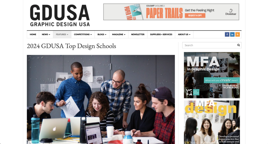
Mark Fertig’s legacy continues through his students and colleagues like Amanda Lenig, a former classmate who now chairs the Department of Art + Design at Susquehanna. Under her leadership, the program has flourished, recently earning recognition from Graphic Design USA Magazine (GDUSA) as a top design school for 2024. It’s a significant achievement, considering the competition includes some of the biggest names in higher education.
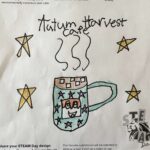
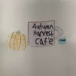
The core philosophy of Susquehanna’s Graphic Design program is simple yet profound: “Process and concept are king. Hard work is the reality, talent is the illusion. See everything. Solve the problem. Give a damn.” This ethos has nurtured a community of designers who are reshaping the design landscape through rigorous, real-world projects. These projects not only build competitive portfolios but also prepare students for the demanding and dynamic field of graphic design.
Offering both a Bachelor of Fine Arts (BFA) and a Bachelor of Arts (BA), the program caters to a wide range of aspirations. Whether students aim for a career in creative industries or want to enhance another major with design skills, Susquehanna equips them with the expertise and connections to thrive. The result is a robust alumni network of professionals working across top agencies and companies nationwide.
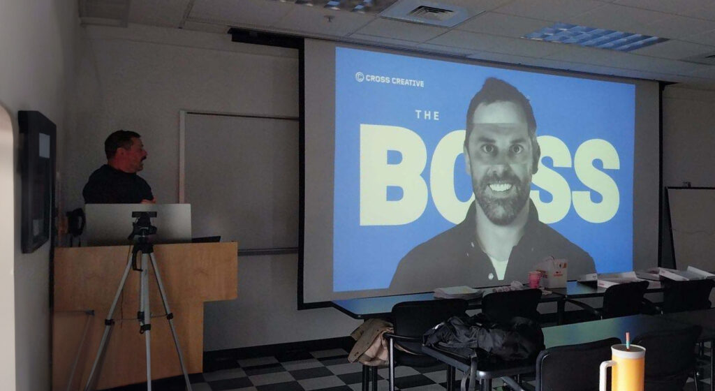
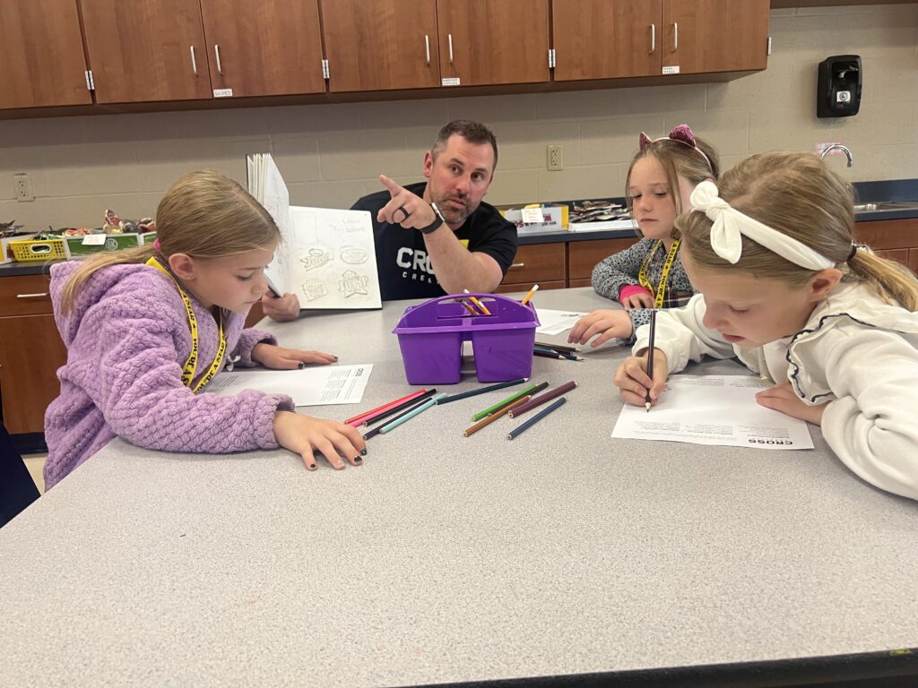
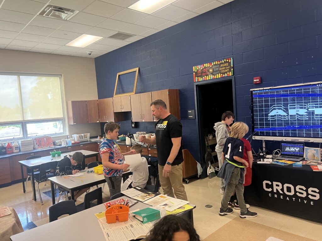
Education at Susquehanna was more than just academic; it was transformative. It launched my career and shaped me into the designer—and the person—I am today. As the founder of Cross Creative, I extend my deepest gratitude to the program and to mentors like Mark Fertig. Congratulations to Amanda Lenig on her well-deserved accolade, and best of luck to all current and future students of the program.
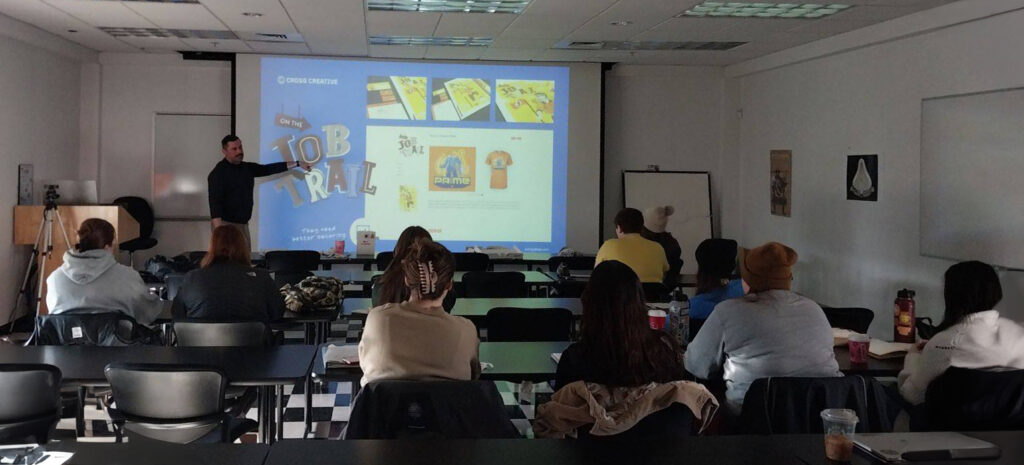
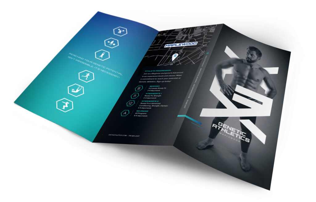
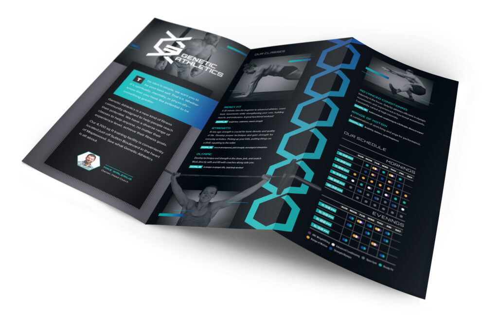
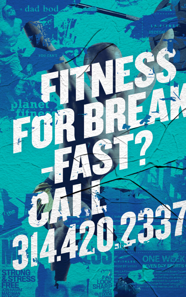
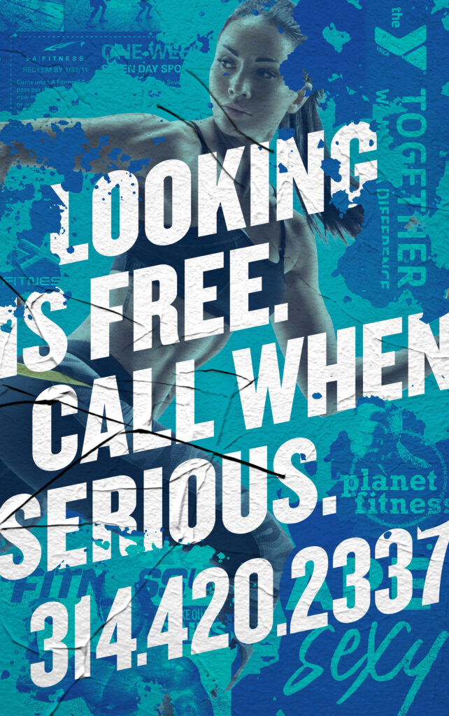
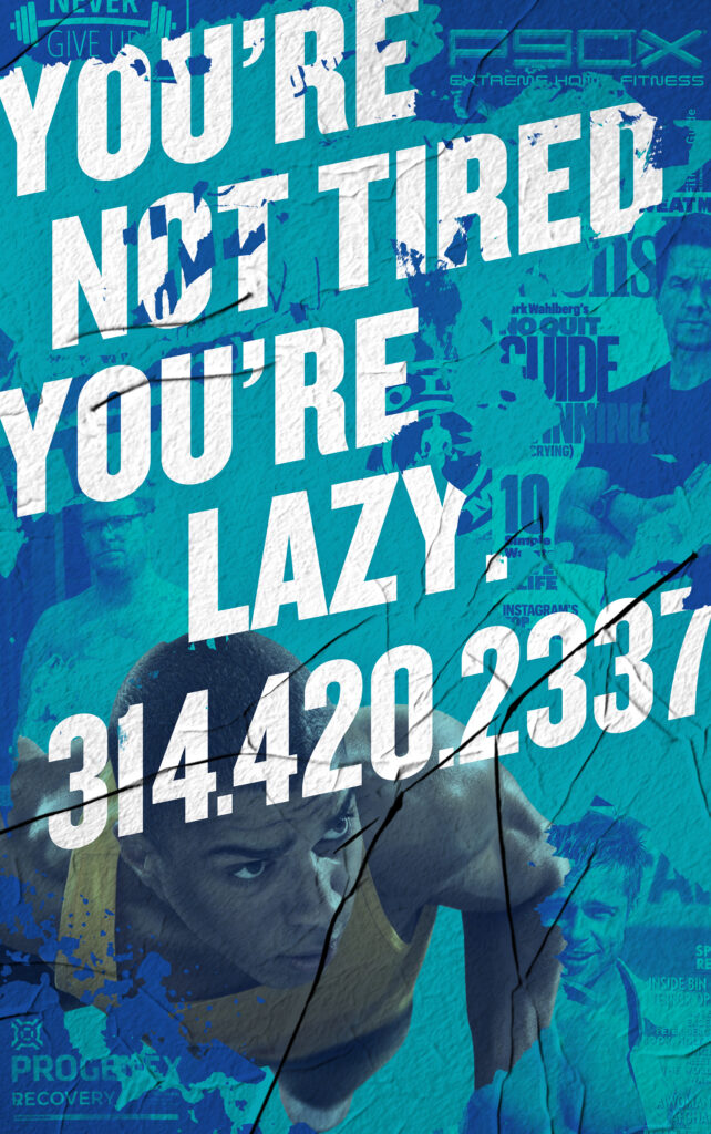
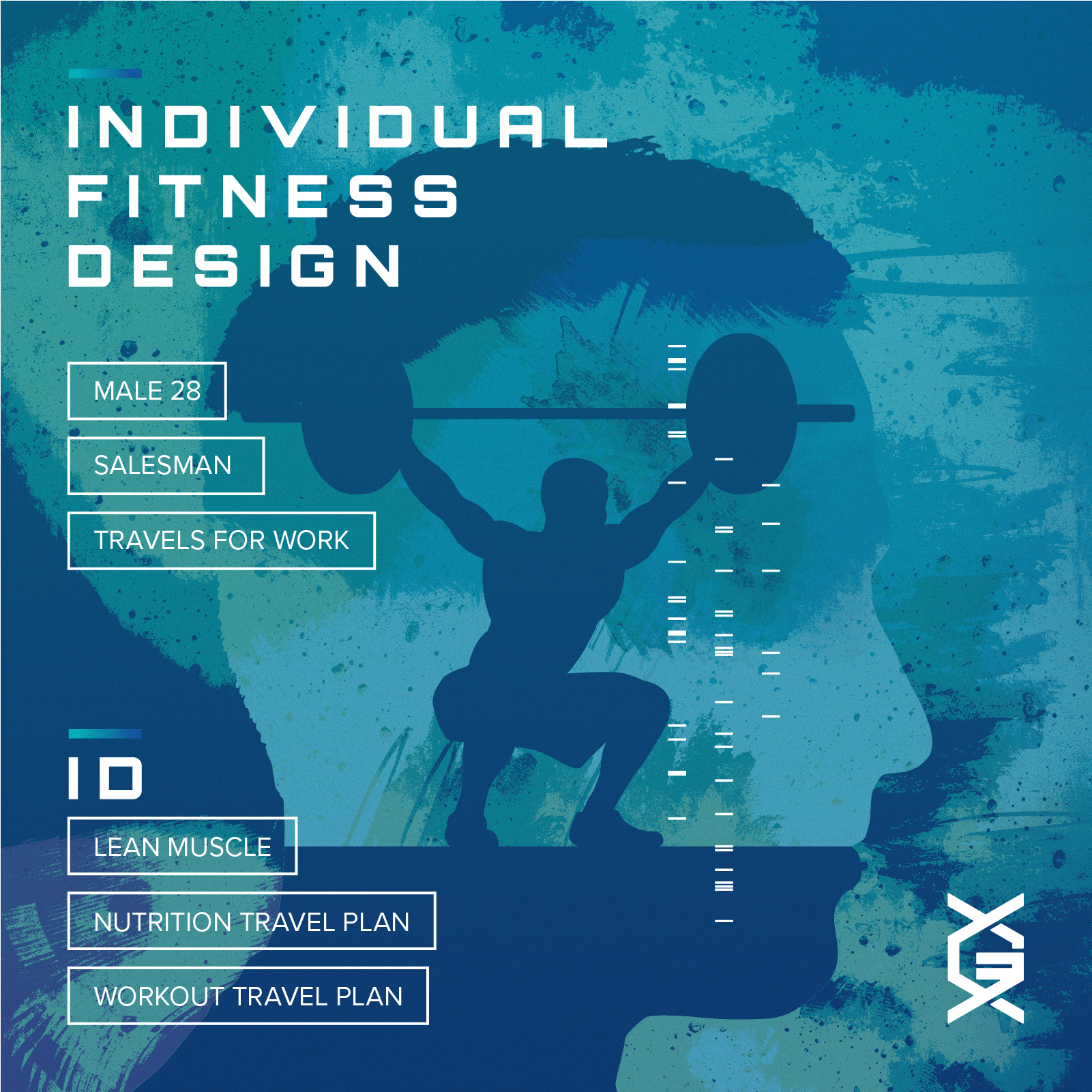
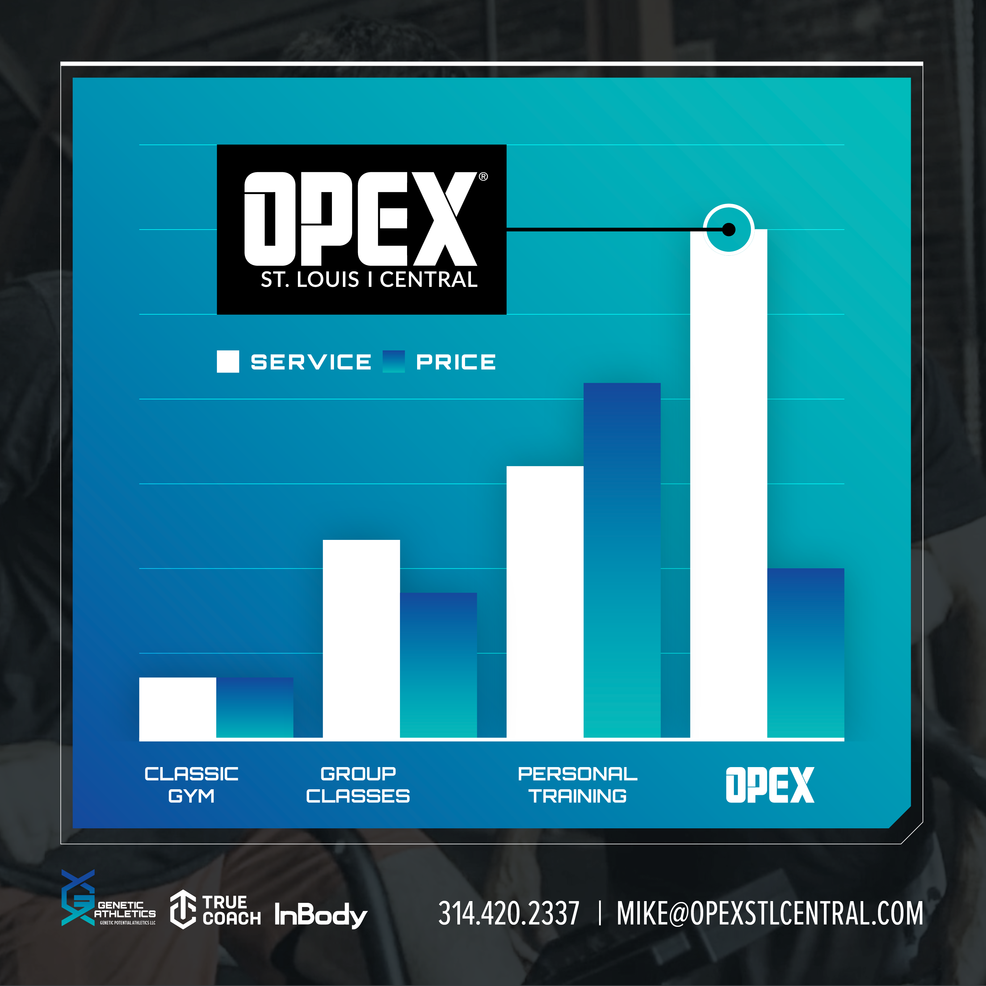
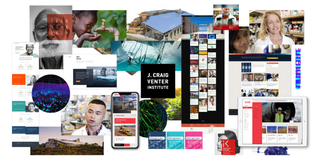
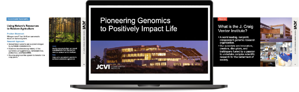
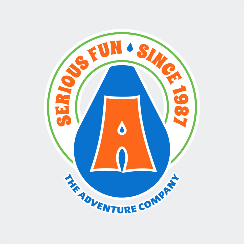
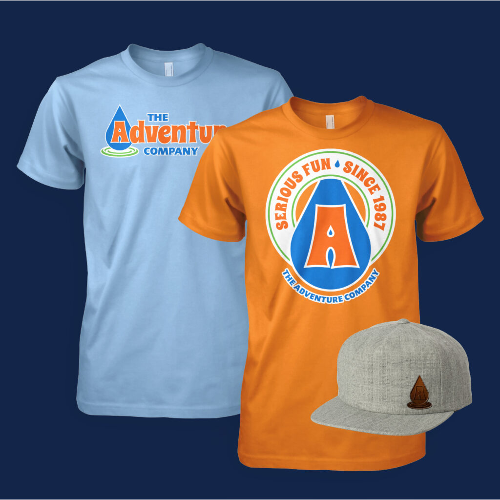
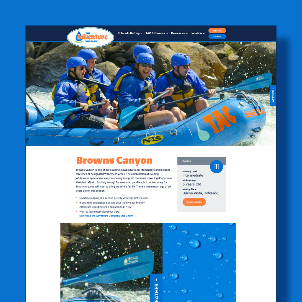
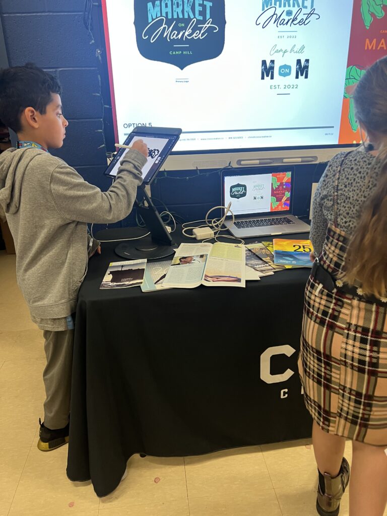
At Cross Creative, we value the strong foundation that Susquehanna provides in the design field. We have had the pleasure of collaborating with several Susquehanna graduates, and their exceptional skills and professionalism speak volumes about the quality of education they received. Their work is proof of the program’s excellence.
As we continue to grow and seek new talent, we are particularly keen on offering internships and career opportunities to graduates. We believe in nurturing new talent and providing them with the tools and opportunities to succeed in this vibrant industry.
Thank you, Susquehanna, for shaping the futures of so many talented designers, including mine. Here’s to continuing excellence in education and to the endless possibilities that lie ahead for its graduates.